How to Create a Visual
The last several months I have been working on creating graphics to go with announcements via Twitter and even flyers to promote events. I thought it would be a fun thing to share with you how you can make simple backgrounds and graphics using your own photographs. I know you can use PicMonkey, Canva, and other online sources to create backgrounds and images. This is for the person wanting to go just a step further and use your own resources or stock sources to create. The tutorial shows you how to work in Photoshop CS6, but you can also do the same in Photoshop Elements, GIMP, or even Krita—any creator where you can create layers and adjust the opacity of the layer. So let’s get started.
First off you will need your photo for your background. You can use your own or one from a free source such as unsplash or pixaby. Deviantart also has good free stock, but make sure you check each artist’s guidelines for using their work. (Some are free no matter what, while others want you to credit them or only use on Deviantart.) What kind of photo do you need? Actually, any with texture. I am using one that has barnacles, sand, rocks, and even a chiton. What would create texture? Grass, small leaves, pebbles, concrete, shingles, wood. Really, anything with lines in it. It won’t be the main picture so you’ll be okay with just about anything.
Step 1: Set up your canvas
We want to open up a new image in Photoshop. Go to File>New.
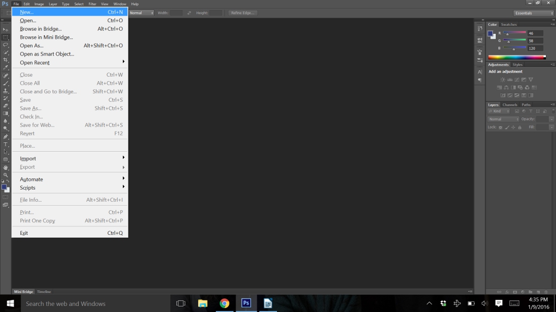
It will open up a dialog box.
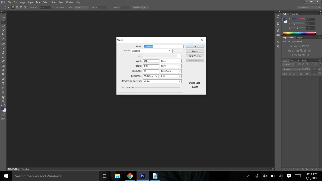
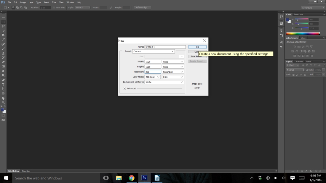
Now is when you can choose the layout of your final image. If I was going to do a flyer for an event, I would switch the pixels to inches and use an 8X10 format. Be careful where you put your numbers. Width comes first, so this formatting would be a landscape layout. For a Twitter image, I keep it at pixels and use 880×440. Your resolution will be important as well. How large are you wanting your image to be printed? If it is just a Twitter graphic, 200 pixels/inch is fine. If it is going to be an 8×10 flyer, you may want to bump that to 300-600 pixels/inch. I’m going to use a Twitter graphic as an example. Once you have all the boxes how you want them, click okay.
Step 2: Opening a new image and pasting it as a layer
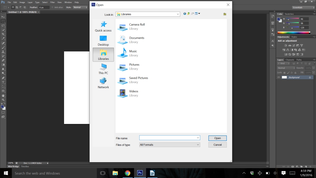
You now have a white background the size you had indicated. We’re now going to work with layers. A layer is almost like a separate piece of paper on top of your background. The paper itself is clear, but whatever you put on it, will cover up the layer, or paper, underneath. So, all that white that is showing right now, is going to disappear when we bring in your photo. To bring in your background photo, we are going to open it in another tab. Go to File>Open.
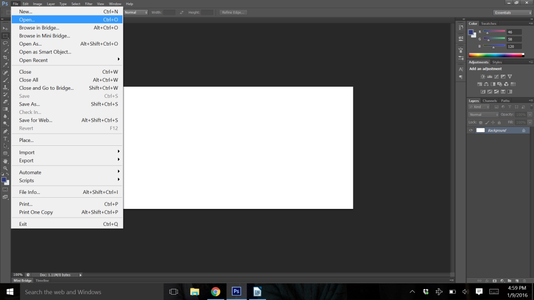
You’ll need to find where you stored your photo. Usually, that’s in pictures. Once you have your photo open, you’ll use the select tool. It is located on the side tool bar and is the second tool down.
There are two ways to select your photo. You can either click and drag the crosshairs tool that you now have until it covers all the picture. Or use Ctrl (or Command on a Mac) A. It will select everything. You will now have a white dashed line around your image. Use Ctrl C to copy it. Click on your tab with your white background that is your drawing page.
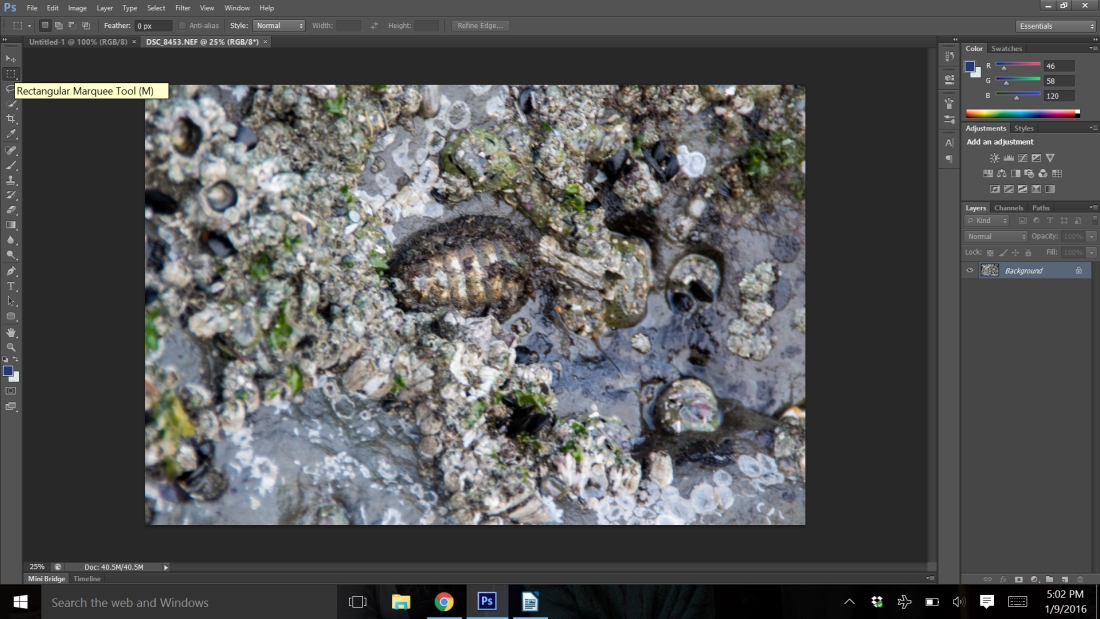
Use Ctrl V to paste the image into your workspace. Now, if your image is like mine, I suddenly only have a small part of my image available to view.
Step 3: Scaling an image
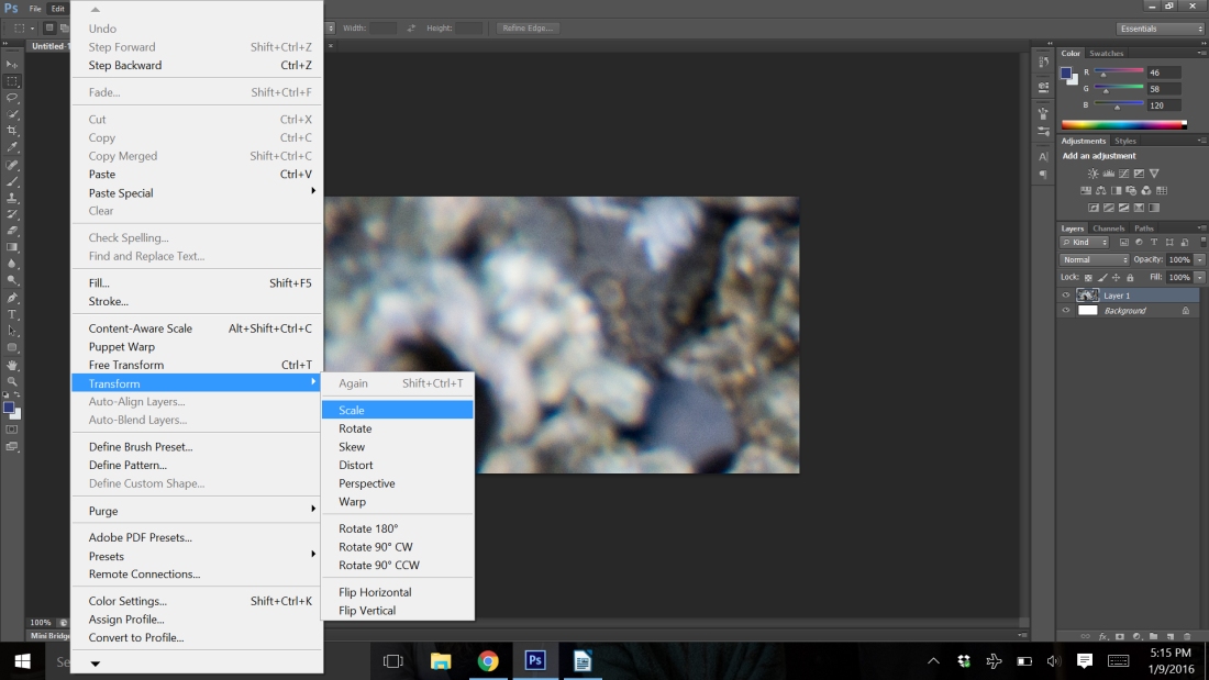
I have several options. I can leave it like it is, or I can scale my photo or move it around. To scale the photo, go to Edit>Transform>Scale. You now have little squares at the edges of your photo. You can click and drag them to size your image and you can click in the center of your image and move it around. Adjust your image to the size you want it and then click the check mark at the top of the screen.
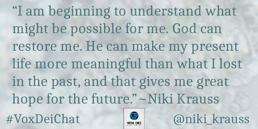
Now, you have just your normal photo sitting in your image at a size you want to display or print. It isn’t ready yet, but we now have an interesting background, but it isn’t ready to have any print added to it, because you wouldn’t be able to read it. So, we are ready to change that. Now, you’ll need to know what you want to do with your image. Do you have another photo that you want to use to display with your words? For example, I wanted to do a quote from author Niki Krauss for a Twitter chat. I used her book cover as the base color for my photo and the color of her text as the color of my text.
Step 4: Working with colors
How did I get the color? We’re going to use another tool, the color picker. It is the sixth tool down on the sidebar.
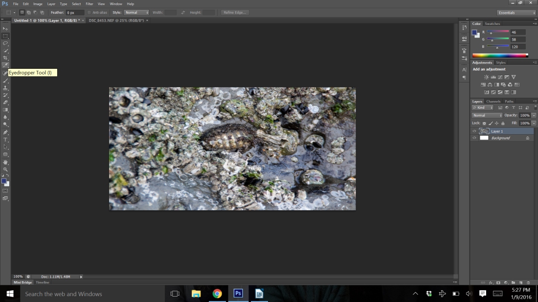
You will need to open up your image that you are using as a sample color. Just follow the steps for opening an image up above. Once you have it open, position your mouse over the color you want and click.
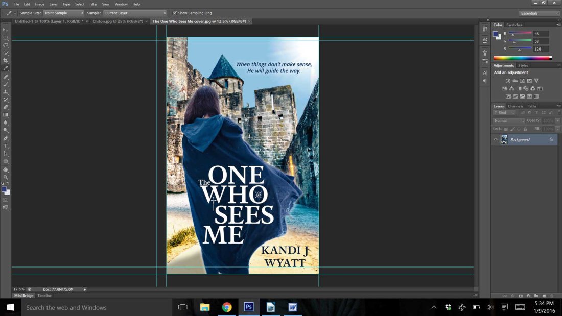
Now you will want to go to the third tool up from the bottom on the sidebar. You will see two colors in little squares with an arrow at the side. You will notice the first square should be the color you chose from your image. You will need a second color for your text. So, click on the arrow and the colors will switch spots.
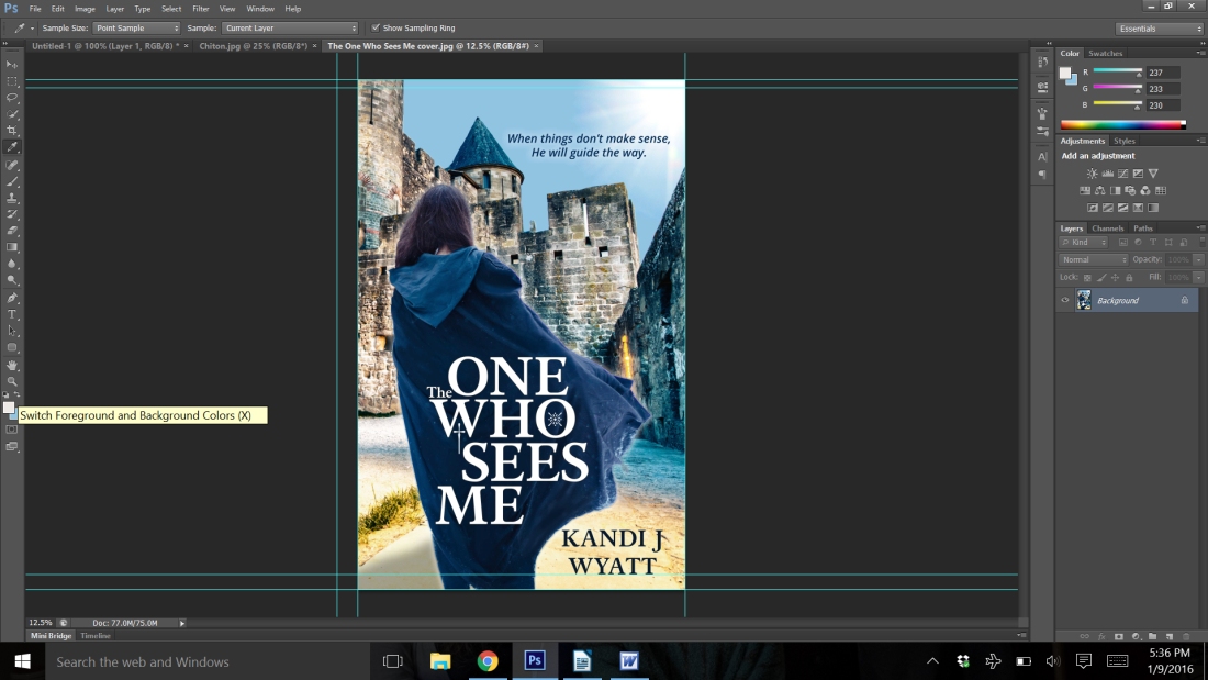
Now you can click on another area of color in your main photo to choose a text color. I chose a color from the path in my cover. You should see that the square box with color is the color that you picked. If the top square is not the color you want your background to be, click on the arrows to make it come to the front. I notice that we now have three tabs open. You will need to go back over to the tab with your image on it. It should be the first tab.
Step 5: Brushes
Next we are going to use the brush tool. It is two below the eyedropper or the eighth from the top on the sidebar. Once you click on it, you will see that the top toolbar now has several different things on it. We want to make our brush big. So, at the second tool, when you click on it you will have the availability to adjust the size of your brush.
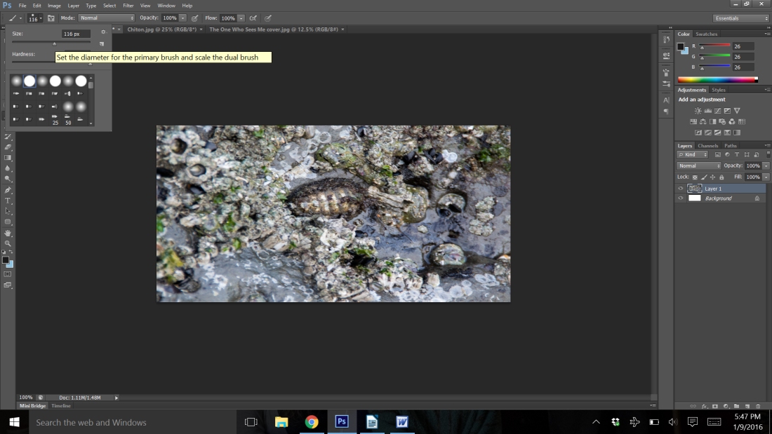
Slide the little arrow over to the right. As you slide, you will see that the numbers get larger or smaller. You want a brush size of at least 116 px.
Step 6: Layers
Now, we need to create a new layer. The easiest way to do this is to use the keyboard. Press Ctrl (Command on Mac), Shift, and the letter N all at once. Or you can go to Layer>New>Layer. Now you have a dialog box open. You can put a name in the box like background color and click okay.
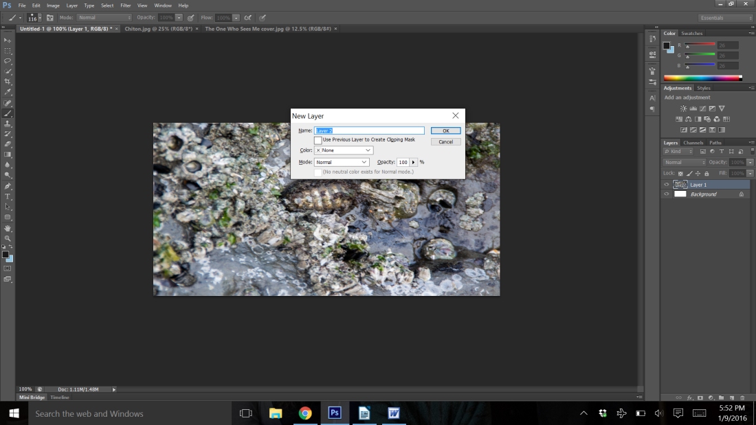
Nothing seems to have changed. We’re about to change that. Use your mouse and click on the image. Hold the click and move the mouse around to completely cover your image in your chosen color. My color looks very similar to our original, but you’ll notice on the far right side on the bottom it shows my layers. I have three.
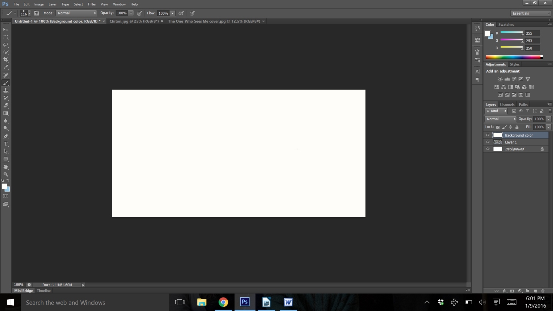
Step 7: Layer Opacity
We’re now going to change the opacity of our background color layer. It will enable us to see what is underneath it and still give us some color as well. To do this, go to the bottom right corner. You will see the layer’s menu. At the top of the layers menu, is a section called opacity. When you click on it you receive a slider bar. We are going to slide it to the left now. If you slide it all the way to the left, you won’t see your color at all. Experiment with what works for you.
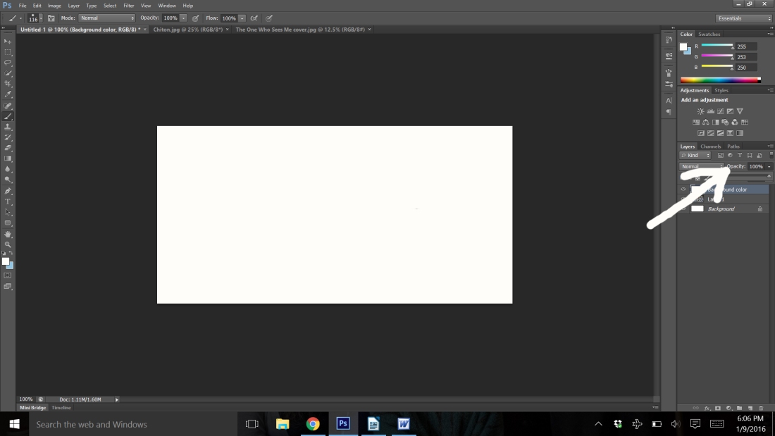
For my photo, I think 83% opacity is about right. However, I’m not liking the chiton right there in the middle. I think I am going to go back and adjust the scale.
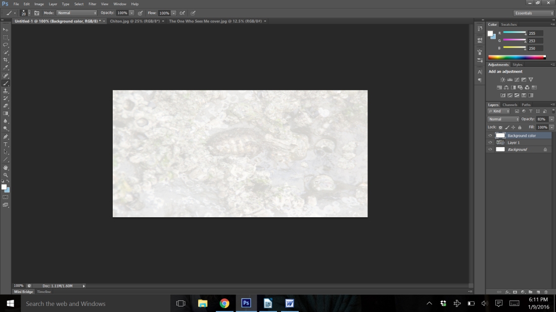
If you want to do the same, you will need to click on the layer in the layer menu marked layer 1. Then go back through the steps to adjust the scale.
Step 8: Text tool
Now that I have it the way I want it, I am ready to start typing in my text. You will want the tool that has a T on it. It’s eight up from the bottom.
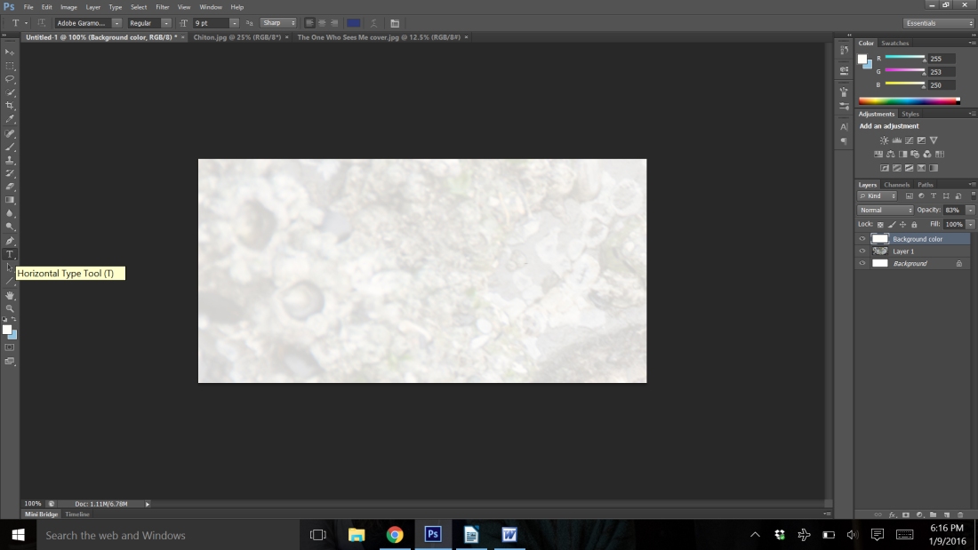
You will need to now change the little square color boxes at the bottom of the side toolbar to the color you want for your text. Click on the arrow to switch them around. Once you have clicked on the text tool, the top toolbar changes. You will notice a color box at the top. It’s third over from the left.
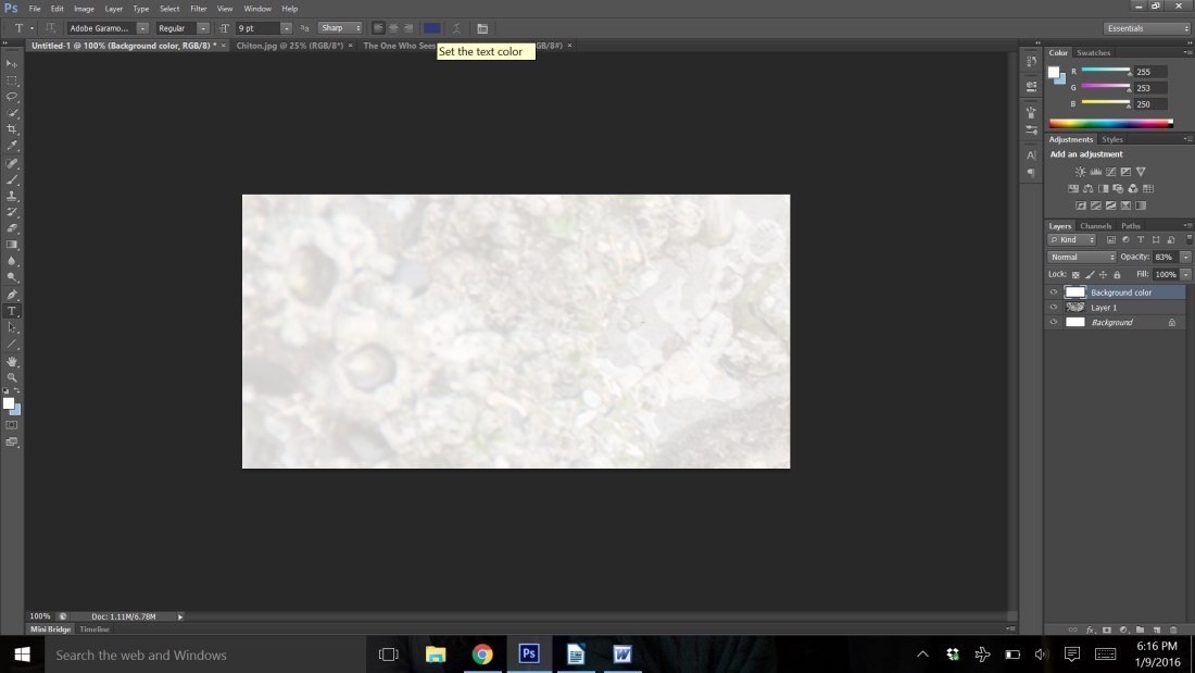
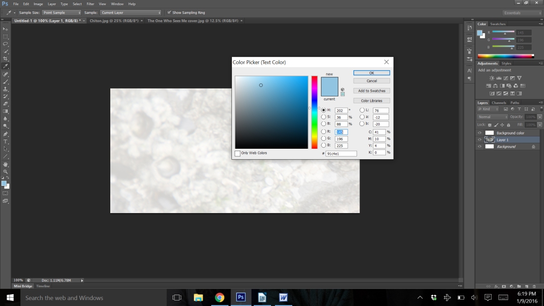
Click on it and a dialog box opens up. Move your mouse around and you will see it is now the eyedropper tool. Go to the square at the bottom of the side toolbar and click on the color you want for your text. Then click okay in the dialog box.
Now you are ready to move the cursor down to your image and click where you want to insert your text. You can adjust your text to be left, right, or center aligned by the tool buttons beside your text color. Play around with it. You may also need to adjust the font size. You can highlight the whole text by using Ctrl and A or by selecting it with the mouse. Then you can adjust the font size just as you would in a document. As you can see, I need to make mine larger.
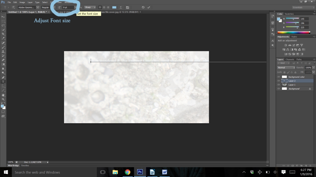
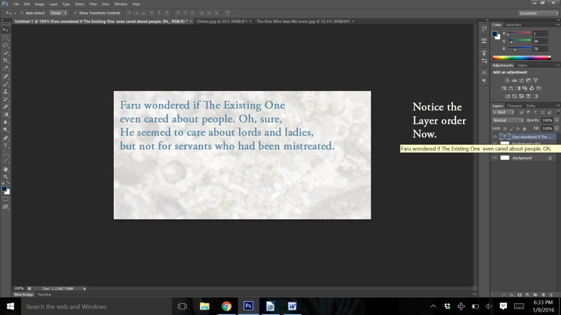
Now, that I’ve adjusted my text, I found that it was very light. My problem was in the order of the layers. Since I had gone back to fix the background image, when I clicked text, it put it under my background color. So, I simply clicked on my text layer, and drug it up in the order on the layers menu.
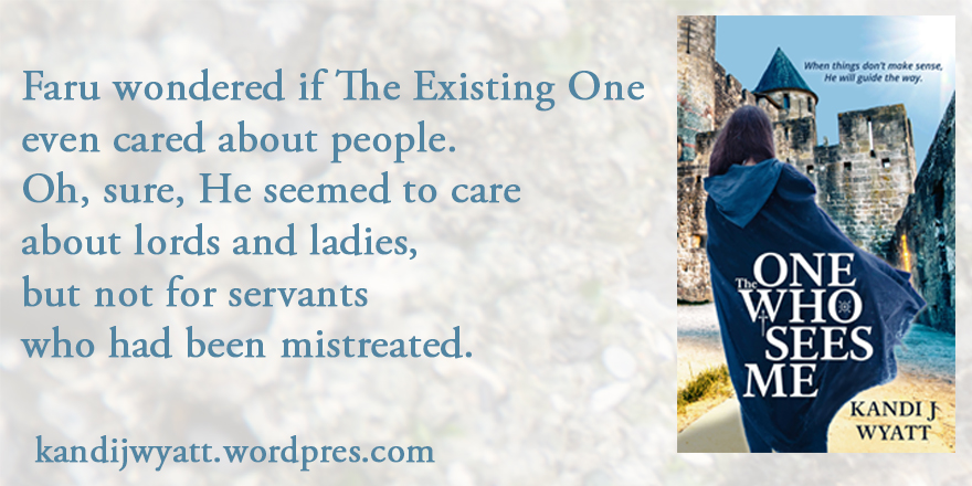
Now, I’m ready to add one more image and call it good. I will add some text to give my website and be done. I will use the same steps as above to copy my image, paste it into the new graphic and then size it. I will use the text steps to add my webpage to the bottom. My final step will be to save my project. File>Save saves it as a Photoshop file. I’ll do that so I can open it up and adjust it later if I want to change the quote or something like that. Then I will use File>Save As and choose jpg out of the dialog box. That way I can share it online.
If you have any questions, feel free to ask. I’ll try to walk you through your issues.


